Saturday, December 5, 2009

HAVE SOME TYPOGRAPHY

I took a typography course this semester, and man did it throw me for a loop! I went from being totally clueless about the subject, and extremely frustrated in critiques, not knowing what we were talking about, to knowing good typography when I see it. I went from "It's just words on a page, I don't understand!!!" to thinking about negative space, composition, typefaces, how to use them for different applications, what is the most legible way to arrange things... all sorts of very very helpful information. I learned everything from how to properly make colors in illustrator for printing (SLIDERS!) to the flow of type on a page. I learned a lot of it in the process of mistakes and critique, and in the end, I feel like I can really use what I've learned in any of my future pieces, in everything from typography to paintings. Hey, maybe comics won't be so confusing to lay out for me anymore, either!
Mr. Meganck, if you are reading this, thank you so much!

Here's my final assignment, a poster displaying a typeface. I picked Futura, because let's face it - my typographic heart is owned by this font.

I looked at both Swiss-school grid typography and Bauhaus typography for this, to evoke something similar to the time it came from. Futura for me has always held this sense of vintage futurism, and hope for that future- like the type used on schools and buildings at NASA in the 1950's and 60's... but here I was going for more of what it really began as.
Also, listened to Benny Benassi music while making it.

Now, to compare...
Here is my second assignment (we don't talk about the first one.)
We had to make a composition with gray rectangles:

and then convert that into type.

Aaack look at my bad handwriting.
I lettered this all by hand, meticulously. I got a little bored, so if you're curious, try reading out some of the nonsense words I put in the boxes... Though one segment is text from my book.
Also done in Futura... I can see that my typography work has some sort of... modernist? slant. Minimalistic, "retro." Which is a little odd, considering my drawings are so sketchy and cluttered. I think part of this course was me learning how to simplify, and pay attention to negative space, and understand that style of typography I admire, and that's helping with my figurative work.
We started off hand-lettering so that we could better appreciate the shapes of the actual letters themselves, and... that worked!

Then, we had an assignment where we made compositions with one, two, and three letterforms. The second was my best.

A 2 and a J from the American Typewriter face. I chose them specifically for their curls.

We had to then design a book cover with the title "The Letterform," and do a composition with letterforms.

I used Univers on this one, and made a sort of character/Chinese-chop-style shape out of "LTFM.", which I'm fond of. This was put in the hallway with others from my class, an honor!

We also had to design three interjections- I did "Oh GEEZE," "Oh SHNAPS," and "oh NO." The latter two turned out the best.

Meganck didn't understand it, but that's ok. I used Hattenschwieler, which, let me warn you, needs careful examination of its letter spacing. You have to watch it!

On this one I got the critique of "It looks like you just murdered someone..." which I consider one of the best comments I've gotten on a piece ever. XD

Then there was an abbreviation to do - I chose "LED" - light emitting diode.

I varied the color in the letters so that it'd sparkle a bit when you looked at it, and it really startled my classmates when it was in printed form, which is just what I was going for. I went through so many color/design options, it was ridiculous. The type is based off of FUTURA again, but I did all of the circles in illustrator.

Then we had a series of three assignments we had to do in which the type was legible, creative, and a combination of the two.
Legible was Times New Roman and flush left, pretty boring.
I loved my second piece, though.

Again, I was going for a minimalist style. I was listening to a lot of Franz Ferdinand, so that was a part of it - thinking of Russian Constructivist typography and such. Also, it ended up looking sort of 80's(or 90's)-inspired...
The third part, though, wasn't as successful, in my opinion.

It works, but it isn't amazing. I don't know... Around this point, I lost confidence in what I was doing with this class, and suddenly became lost - probably worrying about the things that I'd learned, and over-thinking my pieces.
Also, these are intended as a parody of Richmond weather - it's really not too far from the truth!

The next assignment was to do a composition around an important historical date.
I had wanted to do something related to Vlad the Impaler (this being around Halloween...), but Meganck suggested Dracula would be more well known.

I really struggled on this one a lot, trying to come up with the best way to do it. I kept tending to go more illustrative with it than I should. In the end, it's abstracted from illustrative ideas, if that makes sense. XD The idea was a crowd of people, London, and Dracula in their midst. Even if that's not how it reads, the feel is finally appropriate, and I'm happy for that. It just took it awhile to get there.
The typeface is Isabella. I have some issues with the type running upwards (it shouldn't) and uh.. the grammar on that sentence there, but I'm not too sure how to word it otherwise. (Stoker didn't publish it, the company did...) The copy I used was my own overly-dramatically-poetic text.

Now, for the second to last. We had to do a poster with a quote by a famous person (movies were ok too.) I HAD to do a piece for Fight Club, I just had to.

I love this movie, and I had to make something that would do it justice. After going through dozens and dozens of quotes, I settled on this one, which was the best as a stand alone "quote." I love the narration in Fight Club, but it wasn't as powerful as this. I had a much worse composition of this, and after suggestions from the class, I ended up using Helvetica Neue Condensed Black for "Everything" instead of Hattenschwieler, and Myriad Pro and Helvetica for the rest. I also distressed the font a lot to achieve a more appropriate look for it, which I hope isn't TOO distressed...
I'm so glad I got the acid green look of the film into this piece as well.
I think this marks the turning point where I saw "Ok, I AM getting better at this,"and got my confidence back in my typography... Also, it makes me wonder if what Tyler said was true? I was going through a rough patch at the time, and wondered that...

So there you have it. A semester of typography work. I hope it shows how I've come along. I struggled along the way, but now I'm feeling like I'm on a better track.
I'm working on one more piece for extra credit, based off of a song. I'm going to do it on "The Bottom of Death Valley" by Dir en grey. It's a song I always tend to go back to of theirs, a haunting piece... But I am having trouble with it. I can see the piece in my head, but it's not drawing properly. We have to do one piece with abstract marks, and another with type, and the first part's being difficult. Hopefully, I'll succeed, and you'll all see the results here when it's done.
Tuesday, November 24, 2009

Two Phrases

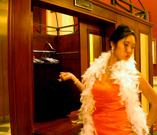
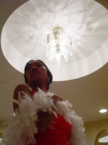
These were photos done for a photography assignment, in which we were assigned one cliché phrase, and one phrase comprised of two words from other phrases.

The cliché phrase I got was "Prima Donna."
Take my coat.

"Prima Donna"

These are my two favorites to exemplify the phrase, but I included others from the series as well.
Here's a link to the set: http://www.flickr.com/photos/24009972@N08/sets/72157622859360734/

The model was a fantastic friend, and the location: the Jefferson Hotel. Her suggestion, and it was an AMAZING one! I'm so glad she suggested it, and thankful for her posing and ability to stay in character. : ] She coached me to be more like a director, told me to stop saying "if that's ok.." because it's my shoot! I should take hold of it! And that attitude really helped- especially with the next shoot!

The jumbled phrase I got was "Freudian Love."
"Freudian Love"
I illustrated Freud's theory of the "Oedipus Complex..." and it was more than a little awkward to shoot... XD I'm so happy, though, that this photo came out pretty much exactly as I'd envisioned it, which is amazing. One of those rare occurences where things work out well!
I'm extremely thankful to everyone for their time on this, and to the "girl" model especially, whose SLR I used. XD I couldn't have gotten the shot without any of them. Also, thanks to the Scott House on campus, who were fantastic for letting us shoot there.
The portrait was photoshopped in, which wasn't as hard as I'd thought. Also, I really should have kept the girl in the same shirt. I thought that it'd be more realistic if she wasn't wearing the same one, but sometimes, for the sake of readability you need to sacrifice realism... XD

Painting Progress 2


8D
For some reason, I'm stupidly proud - I can see that it's finally coming together today. I took Erin's advice about the face - in the last post, she was saying it was too masculine looking, that the cheek was sunken in. I also noticed how angular my cheeks and chin were! The angles were right, but the cheekbone was way too far out. WAY too far out! So I shaved it down, and filled out the cheeks, smoothed the curve on that chin, and... totally corrected the chin. XD The cleft was too prominent, and it wasn't... round. Now I wonder if it looks a little strange, but on the whole, it's really starting to look more like me. Those slight shifts helped so much. And I was getting worried, but I think I might be able to get this done.


Also, I worked on Amy's portrait some more. I added more of the brighter colors that are in the skin, and tried to go back over them with more neutral colors, and blend it, but they're still too bright at this point. I'm going to go back in and normalize them, don't worry. It was a lot of fun to really go at it, though, and paint more enthusiastically and quickly.

Friday, November 20, 2009

More clearly defined


Worked on this portrait some more last night, and I think I got a lot further along. I just sat and measured and sketch-painted in the face, and edges of the clothes. Started to fix down near the hands, but they definitely need more work. Re-applied some blocking in, added more highlights.
But those eyes are so creepy. The face has turned more serious than I wanted, and the eyes being blank make this look like a ghost portrait to me! She was trying to keep from laughing too hard at the comedy cd we were playing, so I caught her 'serious face,' I suppose. So I need to get to work fixing that.

I'm just thankful it's starting to look more human, and more like her, even if she doesn't think so yet.

Tuesday, November 17, 2009

Weekly painting progress!

Here's the progress for the week! or the day, whichever...

YAAAY It's looking better! I'm having trouble with this part of the shirt near the hands - I have to try again at it - and the face is kind of... not all there, but the colors are looking vibrant and nice. I really like that shirt purple. XD I feel like the face has some sort of weird German? or French? vibe going on with it, how it is now. XD My teacher said to focus more on the drawing of it, get it tightened up, and things should start falling more into place.


IT HAS HAIR, OH GOD.
I worked on the hair in class today. Wow... It's looking better than it started anyway. But the color's really too golden yellow, I know. Again, he gave the drawing advice about this, too - that the hair doesn't need to be detailed, just have sharp edges where focus is important - and that's where it's getting its polish. I need to still keep working at it, but it's at least getting some shape. The paint was wet, so I kept lifting paint up as I was going along. It's so weird starting to work on a new part after working with established paint layers! But I jest.
My hair looks like I'm some lady from the 60's. XD It's almost fantastic.
No class on Thursday, so I don't get to work on this until a week from now. Which makes me a little bit sad, in a way. Not much time left in class to work on this!

Monday, November 16, 2009

Painting Progress

This is all of the work I've done over this semester in my "Illustration: Drawing and Painting" class. Sorry to dump it all at once, I've just been a bit slow in getting everything together.


First, these are the paintings we did in class. Every day we had to bring in and object, and paint it within the time alotted for the class - a little over 2 hours. Then, after class was over, we would scrape out the paintings, rubbing it out with gamsol, and start over the next day.
At first, I was pretty averse to that, but it really did help me not be so clingy to my work. It's just the start of a painting. But, there were a few that I really wish I could've continued!
I think I'm only missing one or two here from the whole first part of the semester.


Then, there's the homework. We gessoed some heavy drawing paper, and did little practice paintings every week for homework, and had them checked. I should've done more than this, probably. There's a few I really ended up liking a lot, and turned out well, there's a few that have no merit other than being good practice.

After midterms, we've started on a 'body of work' for the class, and I chose as my subject, people. People are what I find the most fascinating things to study, so I want to paint paintings that show something about who that person is.
I have three paintings going, but one's been put on hold until I can figure out a better composition.

The first I started on, is a self-portrait done in class.

(Why isn't this working? It's supposed to be a GIF. D:)

This shows the progress I've made on it. XD It was pretty horrible to start, I looked like a grumpy man from Renaissance Italy. But now, it's looking more and more like me! I think the nose has gotten too dark, but that's either the paint being wet, or it really being too dark. I'll have to see if I can fix it tomorrow.
It's been a lot of tweaking in order to get it how I want it.
I think this is about 3 week's work? 7 classes? So that's about 14 hours.
And so many more to go!
I really need to get going on the hair and shirt and stop fiddling around with the face... but I'm deathly afraid the eyes are too small.... Are they?


The second, is a portrait of one of my roommates reading. But my teacher didn't like the compostition, and I need to play around with it to find a good one.


The third, is a portrait of a friend. It's been a horrible show of anatomy flaws, I hate to say! First, the head was too big, the neck was HUGE, and the body was cropped strangely. But, the face did look like her. Then, I tried to move it up, but instead, ended up with a monstrosity! I finally fixed it and got the proportions down, so here's hoping it can start to move along and become a really nice painting.

So, that's what I have so far. I'll update you guys on the works-in-progress as they come along!

3D work

So I was working on fixing my clay model for the vest for Tin's project, and I got frustrated just looking at the broken wreck that once was my model. So, I took to making a head out of the clay!


It's Trigger, a character from the same story as Sean, who I did a similar clay head of (that you all saw in that creepy animation...) I've been wanting to make this since I bought the clay. It's very rough, and it only took me a half an hour, but it looks like him, in a way. It's far from perfect. I had a lot of trouble with his left eye (well, our left looking at him), and both eyes ended up making him look Asian. I blame half-lidded eyes, lingering anime influence, studying how to draw Kyo's face, and having so many Asian friends! XD (I kid, I kid!)
Overall, I think it turned out pretty neat. He's a demon, and so his features are supposed to be fairly impish. I think I'll come back to him later to polish him up some more.
It was really horrifying, though, when I realized he ALMOST fits the little 'mannequin' I made for the vest. So strange looking...

In the end, I managed to fix up part of the model, and created the first part of a cardboard model!
The pieces of tape on the front are supposed to be straps that snap down to close the boxes... These boxes actually open and close, and are threaded on the straps for the vest... It took me 3 hours to do this. It was so tedious, but I'd say it's worth it.

It is a little bulkier than I expected, but it's still pretty comfortable. Well, to me at least.

HAIR

Ok, so there's an art to hairdressing. Right?
Since I mentioned it in the 2nd to last post - wanting to do Kyo hair - I've done some research, since my friend said "The only reason why he can do that with his hair is because it's fried." D:

And even if your hair wasn't fried to start, it will be if you put it through that much abuse. Puffy hair requires lots of straightening, hair spray, and teasing in order to achieve, which would pretty much KILL your hair. Or at least, mine. Mine's halfway to a mess already, and it's finally starting to look decent. BLEH.

But, there's plenty of tutorials on the internet on how to get it. Main rules are lots of hairspray and teasing at the roots.

And, here's hairstyling from the man himself! I guess he does his own hair!
At 2:05 and 3:27, there's a couple snippets.

Sorry, I'm a sucker for "behind the scenes" stuff. XD
And he'll do hair for other people too!

Highly amusing~

I think I may end up using a method by another kid, who used some different products and styled it while it was drying to achieve UNSTOPPABLE HAIR.

The video's super long. I just skimmed it.

I also found this in my search for hair styling


My first thoughts were:
1, HOLY SHIT your hair is damaged beyond belief. D: Like a really, REALLY bad wig.
2, so THAT'S how they do it. XD
3, so THAT'S how you're supposed to use those (I have those products, lol.)
4, that's how long my hair would be if I decided to spike it. If I want puffy hair, I need a haircut.

BUT, as said before, it requires a lot of abuse.
I wonder how my hair would look if I didn't have it styled, but cut that way (as in, lots of short layers?) I really do. I'm really more interested in seeing what wacky things my hair would do if left to its own devices.
I keep trying to get it cut like that every time I go to the hairdresser, but they never seem to understand what I want. :\ Maybe I'll just have to take a whack at it myself.
But after I get my self-portrait done!

I'm wondering, though, how long does it take to straighten hair? How damaging is it? How long does it last? I honestly have no idea about anything, because I never do it.

I'm just getting antsy, because I've wanted basically the same hairstyle for almost 2 years now, and haven't gotten it. I think I just need to get it out of my system! My hair now is cute, and I like the way it wants to curl out at the ends a lot - uber cute! - but I never do anything with it. And, it's practically the same haircut I had a year ago before I got it cut, and I am sick and tired of wearing headbands every day. I think I'm due for a change.

I'm also considering dying it, but I have no idea what color. Something either dark or bright, though.

Looking at so many videos, though, it makes me think. So many people doing so many different things to themselves, taking so much time, to look fashionable, or achieve the look of celebrities... it's interesting. I could never do that every day. It's almost foreign to me. I'd definitely like to give crazy hair a try, but if I tried to do it every day, it'd make ME crazy!

That being said, though, any hair tips from anyone who knows more than me? They're greatly appreciated!

More Cosplay

Stuff I neglected to mention in the last post!


1) I have been DYING to make a pair of hakama pants for years. They're a sort of traditional Japanese pants with pleats and very wide legs - like those worn by Rurouni Kenshin and most of the Bleach cast. XD I wanted to make a Bleach cosplay for that very reason, but there's SO MANY Bleach cosplayers out there, it lost its charm. I'm considering either A) saving up the money to buy a pair next Nekocon - because there's a lady who makes and sells them for $65, which isn't bad - or B) making some myself
Wait, THEY HAVE A WEBSITE! :D
http://www.wolfhomeadventuring.com/japanese.html
I think I know what to ask for for Christmas. :3

I'm thinking of sorta-cosplaying the creepy stalker girl from Sayonara Zetsubou Sense - Matoi Tsunetsuki - who wears hakama in imitation of her stalkee, the sensei. :P Since that's sorta what I'm doing - imitating! She tends to wear print kimono tops, and cute boots with it in the winter, which is just a cute outfit. I might just do it. :D Especially since I see SO MANY girls dressed poorly in kimono (rather, failing at geisha makeup....) it'd at least be different, and probably easier to pull off. Because being girlish and creepy is easier for me than elegant. XD

2) Also, I neglected to mention THE MOST INSANE COSPLAY THAT PROBABLY WILL NEVER BE, BUT WOULD BE AMAZING. Screaming Mantis from the Beauty and the Beast unit in MGS4. I haven't even played the game (it's so spoilertastic, PLEASE don't say anything. D:) but I think it'd be amazing. But the logistics of 6+ arms and robotic clothing? RIDICULOUS.
It'd be amazing, but I think that one's relinquished to dreams, at least until I'm rich and famous and have the time and money to make such a thing.

3)Lastly, I was browsing a Dir en Grey fansite for pictures, for possible Die cosplay refs, and Kyo pictures to draw from (:P) and in the process, stumbled upon this one.
http://www.tsukiyo.hu/images/gallery/band/28.jpg
DDDDDDD8
WHY ARE YOU ALL PRETTIER THAN ME?? IT ISN'T FAIR!!
Kaoru and Shinya's dresses are AWFUL nice - the two on the outside of the group - but GOSH, KYO. MY GOD YOU READ MY MIND. XD I LOVE colors like that - just look at this blog! - and omg. HOW did I not see this picture before. XD
It's from Myaku, a single, also from Macabre. XD But holy geeze, there's more cosplayers of THIS outfit on cosplay.com than that Die outfit I was looking at. 0_0
The more I'm looking at their stuff though, the more awesome outfits I'm finding. XD So I may have to re-evaluate what I want to do for a Diru cosplay~
Besides, the tubing on that dress is not nearly as flourescent fantastic in most of the other pictures... sadly. So this must have a boosted saturation.
Oh well, at least it gives me some interesting ideas for clothing... PLASTIC TUBING...

Thursday, November 12, 2009

So... Cosplay...

So, I cosplay!
And currently, I'm faced with a dilemma. I'm finally done with my Girlycard costume (a girl version of Alucard from the Hellsing manga) much to my delight! I wore it this past weekend to Nekocon, and it was pretty awesome - except for being extremely hot in a full wool coat. XD
Here I am in the lovely hotel~!
https://blogger.googleusercontent.com/img/b/R29vZ2xl/AVvXsEibQyxKBX8l6pH2C5lEEHvVqKxEvOYcNh4y2hK828lW4H-Zqa3hcaTH8jFPxYLcspuibY0_rH71Ews7cpBOWo1qvCKAQyiX0DT1sjgaTj3DFdtyg2t0Kg5BOkMYy9soPRqENswmIkAhfw/s1600-h/DSC06470.JPG

Anyway, though, I've worn this costume to the past 3 cons, and I think it's time to give it a rest - at least for a little while. I also have SOOO MANY ideas, it's starting to boggle the mind.

THIS is what I'm looking at.


The first two costumes, I've already started on and never finished. XD I'm pretty sure I'm going to finish at least some of the Envy costume - because I was going to make it into a fantastic swimsuit, and I have shiny black material and everything. So even if I don't cosplay in it, I'm going to make myself the best damn swimsuit ever.
I had designs on making his weird hair out of strings of silicone caulking, but I got frustrated with the black I was using, and it turned me off course...

Franziska Von Karma was going to be the cosplay for Nekocon, until time crept up on me and totally threw me off. I have a skirt, stockings, shirt to modify, (borrowed)boots, gloves, even the whip. I have a white wig I need to color to get the right shade, and I have to make that crazy vest, and sleeve poofs. I was going to cut the buttons from a sheet of acrylic... etc. I just don't know if I should finish it or not. Maybe I'm de-motivated on it. But it would still be awesome to do.

The rest are ideas I've had floating around for awhile, and also more recently. XD
All of my cosplays are usually gut reactions of "that'd be SWEET to wear!" and these are all no exception.

Asuka, I want to do her plug suit BADLY, but it'd be such an undertaking. x_x I've always liked that suit though, even before I watched the show - and at first I hated her character when I finally did watch it, but I found ways we were alike, and so I don't mind playing such a bitch, hahaha. XD
I'm thinking of possibly doing her lolita dress from an illustration in the meantime. It's pretty damn cute, and it'd give me the chance to perfect the hair and demeanor before getting the suit done.

An idea I got recently, due to Daft Punk-ness on the part of my friend, was Stella from Interstella 5555. I remember she was what I latched on to, besides the song "One More Time" back when it first came out. They were my first taste of Daft Punk, and I loved her design - I wanted to make a blue Barbie for a long while, haha. It'd be a pretty interesting and iconic cosplay, but I don't know if I have the body for it! And blue makeup would be... difficult to say the least. But it'd be amazing if I pulled it off well.

Another member from a band! Die from Dir en Grey~! The moment I saw this costume, I wanted to make it, I'm serious. The one on the left, with the mask and dramatic hair? Oh goodness. But I have no idea what it'd be like in a PVC suit all day, or what my mother would think! Or how hard it would be to make - especially since it's pretty hard to see the details from photos I've found. I could, alternatively, do the tour outfit, on the right, which is very similar, and with easier to manage hair. XD Of course, I'd zip that up a bit more. So maybe a combo of the two?

Also, as a side note, I want to learn how to do j-rock hair. D: I really tend to like Kyo's bleached out, puffy hair styles a lot, but god that would ruin my hair. I'll settle for the styling.

Last but not least is Ryoko, from the many Tenchi Muyo series'. She was my favorite character as a kid watching that show, she was like my idol. :D And now that I know, a sexy beast. XD Funny I wanted to be like her....
I want to do a cosplay to honor her someday, don't know about right now, though? Ah, but no one does the 90's series anymore~! I've wanted to do that blue dress from as long ago as when I was starting out cosplaying, and saying "This one would be easy!" instead of being stupidly ambitious like I am now. XD I can't pick another one, though, and unlike most of these, it'd be a costume that's actually *gasp!* comfortable!

Anyway, these are ideas floating around. I don't really have the time for it, but a girl can dream, right? I guess I'm worried about picking anything out for next year yet, because I don't want to be "meh" about it by July. But most of these costumes are ideas I've had for months or even years, so I should be good, right...?

I also am wondering about 'originality,' because a lot of these are pretty commonly done (though I've never seen most of them personally at cons). It doesn't matter TOO much to me, though, because often times, if a costume is common, it's been done BADLY quite a few times too - so I always have this tendency to want to make my costume the best version that anyone's seen!

I'll figure it out. But if anyone has any opinions, feel free to give them!

Wednesday, November 11, 2009

Photography experiments

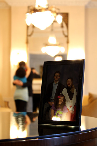
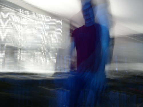
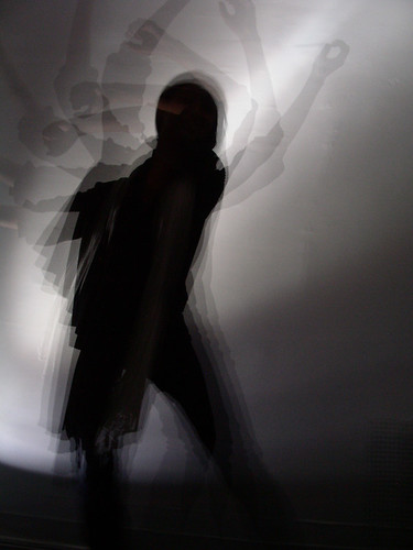
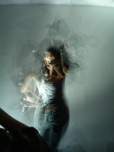
So our class made our own 'lighting studio' in the classroom on Monday, and it was very interesting! We took some amazing photos with a strobe light, which was an opportunity I don't get often.

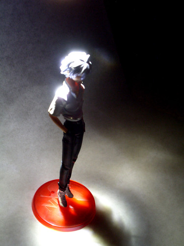
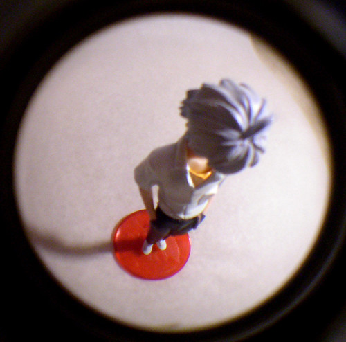
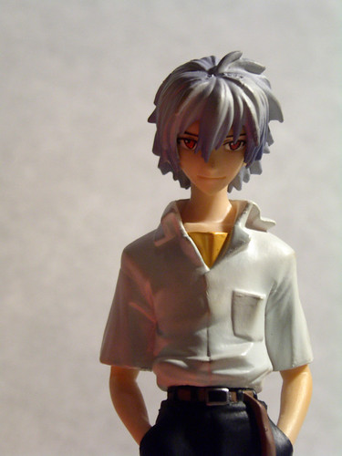
I also took some photos of my 'object' for the day, a Kaworu figurine from Evangelion. I did a whole bunch more photos of him when I got home, playing with different lighting effects. It was certainly a challenge trying to get good shots of something so tiny. D:

Have some examples!

Frankenstein

arc

prayer

ocean


from above

distorted - above

casual stare


Here's links to both full sets on flickr:
http://www.flickr.com/photos/24009972@N08/sets/72157622780716898/
http://www.flickr.com/photos/24009972@N08/sets/72157622656461577/

Friday, October 30, 2009

Doin' it for Kicks

Ok, so I go on music kicks. XD This semester, first it was Tool. Then Justice. Then Tool again. Most recently, Franz Ferdinand.
And now I'm on a Dir en Grey kick. XD

It started with me giving them a listen randomly a few days ago? And then Erin was playing it in her car, and we were talking about Kyo's voice going from all the abuse he's putting on it. (;^;) But later that evening, I was looking at Daft Punk stuff on Youtube, and that freakish baby thing from Technologic was on the screen, and somebody's like "If you think THIS is creepy, then check out Dir en Grey's 'Obscure.'" So of course, what else could I do but look at it? XD

Here it is in all it's crazy glory - DEFINITELY NSFW. Or safe for probably most people's eyes. XD


It was just so horrible and disgusting and disturbingly sexy and amazing and beautiful in its ugliness that I... I just love this kind of shit. XD

This has officially launched a kick. XD

Someday, I want to go through all the albums and figure out what they're really saying in the lyrics - the above song, for example, is about abortion and it's commonplace-ness in Japanese society.. because being a single mother is not an option, and birth control is not so easy to get...

But before we move totally on to the Diru kick, The Franz has to say something:


I'm REALLY diggin' this song too. :D I think I might just do my moving typography piece on this... if I get the time. D: At least on part of the chorus, because I can see it in my head.
"Whoah-ho
LOOK OUT
You're what she CAME for
NO QUESTION/NO DOUBT!"

Either that song, or this one, which I ADORE and launched the Franz kick in the first place:

I just love how entirely whacked out these guys are in this. XD

Hahaha, such a contrast. Franz Ferdinand is all about dance music, kinda happy quirky and weird, and sexy, and Dir en Grey is about dark macabre rock music... and sexy. XD I THINK I PICK THE BANDS I LIKE BY THEIR SEXINESS, LOLZ.

Gaaaaaah but I want to draw Kyo now SO BAD. I think the combination of zombie walk+this = SPEWING BLOOODDDDD FTW!! I'm wondering if I can draw him for my Tin sketchbook - if a few can be from photos, then.... >BD BWAHAHAHAHA.
2 pages from photos out of 100 isn't bad at all right?

TO HOMEWORK~!!

But what, I ask, do you make?

Now some of my work!


This is what I'm proudest of, and maddest at, currently. XD It was my final for an animation class I took in the KI department last year, and it took me SO LONG to get to just that point. I have a few more seconds storyboarded that I really want to do, and so much more I want to fix and tweak. It's my dream to get this actually fixed up and made into a REAL trailer someday, with color and backgrounds and all of that, because this is just the key frames right now...

http://seira-chan33.deviantart.com/art/some-kind-of-temporary-sanity-138509230
and THIS is the aforementioned animation that I did for class recently - I made a quick armature from wire and pipe cleaners for a head of Sean, the main character of my story, that I'd made from a kneaded eraser on a car trip months before. XD He runs into crazed kewpie dolls and molests a styrofoam wig head, what more could you ask for?

If you want to watch more animations, they'll be on my youtube page here. : ]
http://www.youtube.com/user/seir323
I don't have everything up yet, but I need to correct that!

More animation inspirations from the dregs of my Youtube Favorites. XD

A smattering of things from my youtube favorites.. : D


A piece of Jamie Hewlett's handiwork, by his Zombie Flesh Eaters studio, done for the BBC for the Olympics, containing his characters from "Monkey" - an opera version of the Chinese legend Journey to the West.
I REALLY love Hewlett's work - Gorillaz, especially, were an obsession in High school of mine, and a major contributing factor of how I got motivated to go to art school in the first place.

ALL of the videos for Demon Days were extremely important to me, but probably none can top the first (even though I think each has their strengths - El Manana being the most cinematic, I love the lighting in Dirty Harry, the dancing and humor in DARE.) But Feel Good Inc. was the one that started it all. I had so many theories around what this song meant, and Gorillaz in general ended up playing such a huge part in the development of my work, it's not even funny. XD


I like Disney too. XD You just CANNOT top their animation, pretty much.
This was from me re-discovering this movie, actually - I hadn't watched it a lot as a kid, and thus forgot all of the stuff that's in it. XD And I love Clopin~! The way he moves!
Here's hoping Disney gets back on top of it's 2D animation. If ANYONE doesn't know about this....

THEN SHAME ON YOU. XD
I'm pretty stoked there's going to be a 2D movie coming out soon, you don't even know. XD

MOAR OF MY CHILDHOOD!:

Batman was always captivating. I think, even as a grown-up, now, the visuals are striking, and the mood mature, the stories and characters intensely interesting... Kudos to these people!

Also, I'm a Hellsing fan. :D
The animation in the OVA's is top-notch, and keeps getting better. And also, they're gory and awesome. XD


Opening to Sayonara Zetsubou Sensei, an anime with a very dark sense of humor... :3


This is a trailer for a movie I haven's SEEN, but have great interest in seeing. XD Worked on by, god, I don't remember his name, but a guy from Gainax, with a crazy as shit looking story, and such colorful animation, and look at all the black shading!! The animation style is just really interesting and fun to watch.


(Currently, and probably for a LONG time..) My favorite anime movie. D:
Miyazaki aside, this is just... AMAZING. I LOVE this show, and the movie is like the show amped up to 11. Beautiful, dramatic, interesting... Best... movie.. ever. D:


This was an awesome looking trailer, but sadly, it's for a comic and not an animation. XD


Ok, this isn't really so much in the "animation" category as it is games, but it's just such a powerful piece, that I played the game before this one, it was that motivating. XD I looove the music. I think part of why I love animation so much is that music can go with images, just PERIOD. It is an amazing nexus of the two..


Ok, NOW, for those Tool videos that inspired this one animation I did for class... XD

The most MAJOR influence, this is just... awesome... on multiple levels. It reminded me a LOT of my story... because the main character could almost be the one singing... All of Maynard's music, singing, I associated with that character since practically the beginning.
The animation is amazing, the concept is haunting and very interesting... It's fostered an interest in stop motion for me, personally, because I love dolls so much... why not put them to work?


My other favorites, video-wise... :D

Ok, I think that's enough for now, don't you? :D

ANIMATION GO!!!

Here's just a smattering of things that I found that I REALLY liked as examples of good animation. This is just one post, but I could probably fill a whole blog with just stuff I liked. XD


Fran found this for me and it's AMAZING.
This was directed by Todd MacFarlane and apparently handled by the same studio that did the Batman Animated Series back in the day.
OMG I LOVE IT.

(also this studio really knows how to do awesome chicks. XD)
But I think it's also just... kind of amazing. And a great juxtaposition (lol THAT word) between the saturday morning cartoons of my childhood and such serious subject matter.
It's fast and great and RAWR I AM MOTIVATED BY STUFF LIKE THIS OMAGAW. XD


and this


Both from Erin!
Both from Erin. <3

And these, which I didn't post when I found them, lol. XD

Vocaloids kinda creep me out and fascinate me at the same time, but the animation's hella nice!

-A Tiffany find of awesome~

So haunting and beautiful. D8

And another from Fran!

IT HAS THE COMBINED POWERS OF THE GUY WHO DID DIGIMON AND TAKASHI MURAKAMI. IT'S FANTASTIC. XD

Hello!

Here is a blog for work that I'm doing in-class and otherwise, inspirations, etc. : ] I'll try to be make a better effort to post actual PHOTOS of in-progress work instead of just talking about it, and be, in general, a better member of the artist community with this.
Hope you find it interesting!

As to who I am, I'm a VCU art student studying Communication Arts (that's illustration, etc, NOT Mass Comm.) and I hope someday to be involved in the animation industry, because I just find the result of all of that hard work to be just sheer magic. I want to make work that is mature and thought-provoking, and interesting, with lots of character development, etc. - all stuff that makes me drool. XD And look amazing! But I also have an interest in making comics, dolls, doing photography, music... It kind of goes all over the place.

This blog will, at first, have a few posts that I made previously on other blogs of mine (that I made in the meantime of getting this one) and then I'll be using this as my primary art blog. Enjoy!