Thursday, December 23, 2010

There they are!

Finally, we have these two perfected. Stylized, cleaned up, and likenesses procured, I am proud to present Ruth and Virgil in all their terrible glory.


Size comparison and final values

Full sheets:


FACESSSS YESSS

On Virgil I got significant help from Erin Conley, his creator, on everything from what he would wear to how he walks, and ESPECIALLY the faces. The 3/4 view is based off of one of her drawings, and the front view had its start from another sketch of hers, after much debate and critique had been had. I literally could not have done it without you!!

It took our powers combined to get this stubborn man to look like he should, but it was well worth it. : ] I can only hope he looks as accurate to Erin as he does to me. XD

Ruth was a struggle in and of herself, but she too looks exactly like she looks in my head. I'm terribly proud of how these two turned out. When they finally reached this stage, I was overjoyed - whereas before, I made them look human, their bodies were correct, now, it's really them staring at you from the screen. I couldn't be happier with the result.

In more technical news, I also made a sheet for myself of how to further simplify them - the basic shapes they are comprised of. So right now, as I'm working on getting the key frames down, this is about as detailed as they look:


So I'm working mostly from this sheet, with only one eye on the others for now. Once the keys are roughed out, then I'll go back in and make them look just as polished as the ref sheets. I've got my work cut out for me, that's for sure!

Probably going to be a little quieter on this front while I'm working, not wanting to release too much information, story-wise. Storyboards are done and have been done for awhile, but are very rough, and again, would give it all away! So now I'm working on the key frames - the main points of the action. When they're done, it's time for inbetweens, then adding values, fleshing out the backgrounds, compiling, editing, music, etc. There's a ways to go, but I hope you'll all be patient for me to return from the journey with these two. I'll send you some postcards along the way. : ]

Monday, December 20, 2010

Boot up

My website is up folks!! It's not TOO impressive, merely a skeleton for now - I still need to upload images, and figure out how I want to embed video into it - but the design is all done and laid out!


http://walkermovingpictures.com/


I used KompoZer, a free WYSIWYG software similar to Dreamweaver. I used this website's tutorials to get started, and they're a great help - this is just the KompoZer page, but they have lots of helpful information on Dreamweaver and general web design elsewhere on the site.

When the site is fully operational, I'll let you know!

They're watching you.

virgil,western O_O ruth,western

Just a hint of what's brewing. I finished their faces from 3 views, and put these together to see if they really do work.

Virgil's eyebrows waggle at you, but I knew that would happen - otherwise, they're pretty danged consistent.

You'll see the full designs once they're polished!

Tuesday, November 9, 2010

Mathematics

Just a short post to show something I've been working on as a leave-behind. It's a thaumatrope, a toy popular in the Victorian era that demonstrates persistence of vision. When spun, the two images come together to form one.

I have this version, as well as one printed on a postcard that can be cut out by the recipient.


I was actually a bit nervous to use this as subject matter, as innocent as it is, so thanks to those who encouraged me. : ]

Thursday, November 4, 2010

Character Design

Hoo! It took me a long time, but I finally got the character sheets for these two completely done. The files are large, so be forewarned if you have a slow connection! Also, nudes, so NSFW!

Ruth:

Virgil:

Size Comparison:

I went through multiple steps and countless references to arrive at the final results. I did anatomy first, made sure that was right, and that faces were accurate, then went on to do their basic clothes, and then how the coats, hats, etc. would hang over them. I had to make sure they were historically accurate, true to character, and fit properly. The final image has values applied, to get a better idea of how they'll appear in the animation.

All the endless revisions and research paid off, though. It's just great to see these two as fully fleshed-out people.

The last image is the height comparison, a kind of marking point for myself, the most pertinent information out of all of these - how they look (clothed) standing side by side.

Also, these need to be added to the wall of madness in my room. :P

Anyways, since finishing the sheets, I've moved onto trying to simplify and stylize them for animation.

This is pretty close to what I want. (I also love Ruth's terribly derp face here.) Virgil's been slimmed slightly, to emphasize his height, and Ruth's joints have been thinned, to make her seem a bit more fragile. You can see my notes of ideas to try, but I think I like this quite a lot. I tend to work in an angular fashion, and it's fun besides. They're angular people.

I still need to figure out shading, been playing with it to an unsatisfactory degree.

As a bonus for you guys, I did this piece as a joke. Erin Conley (Virgil's creator and the originator of all of this) commented thought of how terrible it would look if they were SUPER KAWAII DESU NE anime-fied, and so I of course had to draw it. XD Don't get me wrong, I love anime - but this Western is decidedly NOT one.

THIEF Monogatari is what the title reads, haha. I know that hand is way huge, and the anatomy's not perfect, but it's just a doodle that got way out of hand. I find it somewhat unnerving to see the two of them so smiley, haha, and Ruth's eyes so big. I am especially proud of that crazy coat, though, and their poses. I think the linework being thinner would really push the 'anime' look, but I thought of it too late.

Anyway, I'm currently working on storyboards, and I have most of it roughed out. Now it's all a matter of refining and getting it to something I can work from, (as well as finalizing the style) and then the animating can begin!

So next time - Storyboards sneak peek!

Sunday, October 10, 2010

We Love Westerns

Long time no see! I just thought that I should post some of what I've been up to, since I've been working very hard, and I'm extremely proud of the work.

I'm taking Senior Portfolio this semester, and in it, as well as working on the business side of things, we have to work on 4 projects for our portfolio. My professor is allowing me to work on one big project instead, however - an animated short.

I'm doing it based on a Western started by my good friend Erin Conley, and written by myself, her, and a few friends. The animation's straying just a little from canon, however for simplicity's sake. It's about girl meets man, thievery, and the difference between seeing things in black and white vs. being morally grey. But you'll see all of that later in the story!

It's been a challenge to just narrow it down to "It's a Western about a girl who's a thief" for me, but a good one - because with a short, simplicity is key.

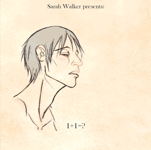
So now, onto the art!

I started with doing research on silent films, and because I want to play with both the visual style of them and photography from the time period (1890), as well as the themes, cinematography etc. - and warping that somehow. I did some sketches trying to figure out how to work, and I decided this animation's going to be hand-drawn on paper, not computer, and shaded in pencil - purely for the grit and amount of control it offers. I might play around with tracing paper, as it produces a nice effect.


This second one was the same image traced multiple times, the last being a digital composite.

Then I went on to the actual character designs. We're dealing with Ruth Quinn, my character - 23 years old, 5' tall, thin little ragamuffin, as well as Erin's character, Virgil Grey - 35 years old, 6' tall, lanky, gruff, and world-weary. It's been a challenge to get the both of them right - especially working with Virgil, a character that didn't spring from my own head.

First I tried to rough out basic, blocky shapes for silhouettes, trying to distinguish the two.

Then, I did all of my research on clothes from the time, from Westerns, etc, and dressed the two accordingly. Ruth has elements of young boy's clothing, as well as that of workers - and all of it's old and ratty. Virgil's dressed a little more refined-ly, since he hails from the East, but his clothes are old and dusty from travel as well. I then decided on values for the clothes that would work out and pop if it were in black and white.

I also did it in color for the heck of it, and if I use color tints in the animation. Virgil's color pallete is dark muted browns, whereas Ruth's are orange-tans and blues, also very muted. Sun faded and like the land around her. I'm not sure if Virgil should be darker/less saturated actually.


In an attempt to wrangle in the visual style on this before I did the final designs, I compiled together research and inspiration. I ended up with so many photos for reference, as well as a wall full of stuff. It certainly keeps me focused, besides being handy.
My roommate thinks I'm a little crazy.

I'm looking at everything from silent film and old photos, to spaghetti Westerns like The Good, The Bad, and The Ugly, to more modern Westerns such as The Assassination of Jesse James and There Will Be Blood. It'll be interesting to see how all of that translates into an animation.

I then tried jumping right into the final designs, but I wound up with far too many headaches and a very, very stiff drawing of Ruth by the end of it. A couple of photo references, however, made me see the error of my ways, and a few hours later...

...she finally looks how she should! I think her breasts, hair, and that profile face need a little work, but more or less, this is right. I shot my own refs for the pose, but thankfully I found a model on http://characterdesigns.com with a body type like I needed for her (Melodie.) It's a great resource full of sets and sets of photos, so check it out!
I have many references of different people for her face in order to get her looking like Ruth, but of note is the artist Patti Smith, who I found through Robert Mapplethorpe's photography. How much Ruth resembles her is almost a little creepy.

Then, there was the problem of Virgil, and getting as good references for him. I thank my lucky stars, however, I found Tony Ward. Erin found him as a good body-type reference in some very creative Blue Bell/Wrangler ads earlier this year, and so I looked him up, and luckily there are many, many photos of the man, having been a model for 20+ years. AND, he's 6 foot tall. So I used him, a little Posemaniacs for help with the legs (also another wonderful source), several references for the face and hair, and of course Erin's own drawings. I sincerely hope he looks correct!
I also realized I was making the height difference between the two of them MUCH less than it should be, so I did my math and made sure they were the proper heights.

So here they are! More or less physically accurate. I'm very, very proud of them, and this has been a fantastic exercise for me. It's really helped me get a handle on how they should look, move feel - they have life to them now. I normally use some reference, but not as painstakingly as this, and more for faces than for poses or bodies. I get impatient and move onto the clothes, and end up using shorthand. So to have Ruth look like an real woman, and Virgil like a real man, both with muscles, fat, bones, flesh and blood... it's super exciting to see!

But anyway, enough giddy rambling. :)

I leave you all with the silhouettes of these drawings. I have to finish Virgil's turn-around sheet yet, and then toss clothes on the both of them, but I've got to start thinking of how they're going to be stylized- how much, how far, and how so. Their shapes are pretty distinctive as it is, and similar to the blocky shapes I outlined in the beginning, so now it's just a matter of streamlining them a little for animation. I want to work with shapes and shadows in this, so perhaps lighting them will be the best course of action, to see what happens.

Anyway, this is what I've been up to! I'll post more as I go along, storyboards, finished designs and all. I'm so excited to be working on this, and it's been a great process, trying to accomplish this in a more professional way. This is a big production, but the work is all worth it.

Thursday, July 22, 2010

Animation Retrospective

Hey there, everyone, hope you're well. :]

I finally corrected a massive oversight by uploading all the rest of the short animations I've done in college to my Youtube account, so here they are in all their freshman-sophomore glory! (except for the last one.)

These are posted in chronological order, starting in Fall 2007, to Fall 2009. Some of these were already up on youtube, and I posted the Kragsyde trailer here before, but I'm including them again if you missed them!
Click on the videos themselves if you want to read about how I made any of them, I tried to be pretty thorough with my comments. :]


Wednesday, March 31, 2010

Figure Painting - round 2- studies!


"The Artist in her Natural Environment"

I like the studies I've done for this class much more than the in-class work, because I've been able to set them up how I wanted, for the most part. They're more personal, closer to me.

This first painting was one of my later ones, done after a tutorial by Jorge Benitez that made me really stoked about painting! I was so excited to do it, and the lighting was so great... it turned out really well. I think it's one of the best paintings I've done, and it was only 5 hours painting with a friend (thank you so much for sitting for me!)
Not only for the reason that I like it, and feel it's strong, this is posted first since, out of 4 paintings I submitted, this one was chosen to be in the Anderson Gallery show from our department! I'm so, so happy - I didn't expect anything of mine to make it in! This is the first time a piece of mine has gotten into a show like this!
The show opens tomorrow, 5-7 PM, at the Anderson Gallery on VCU Campus.

Now, for more studies..


"Self-portrait." A more conceptual self-portrait than my last, I was also portraying myself in a way that I'm not used to - with a more sexual tone. I painted this after looking up some things about Silent Hill 2, and I think it marks the beginning of that work's influence upon me, as well.
...I'm terribly fond of this one. XD


A study of my hair, which turned out to be a nice painting of my eye..!


A painting of a friend, with some awesome clothes and hair.


Study of strange lighting on a mannequin doll of mine, done... in the dark with a black light and a glow stick... D: I used a flashlight to check on the painting itself, and some finishing was done with the lights on. It was... rather strange, and I probably won't do something like that again, it's too imprecise...


Study of the stairs that WILL kill one of us eventually, in the Carriage House which we use for Honors studio. I had a lot of fun painting that wall! Just finding all of the colors that light makes on a white wall. It got frustrating, however, since the lighting changed twice! It's very interesting working with natural lighting, though.

Some of the criticism I've kept getting from my teacher, however, has been to watch the edges in my work - I like them being rough, but it wasn't PURPOSEFUL. Also, especially in class, the advice has been "USE MORE PAINT!" and so I've been working on these things as I keep going along, and it's helping quite a bit! The painting at the top was done being very mindful of edges and blending, and it shows.


A test of cool light and warm light. The one on the right was done first, when I was in a foul mood, and... that also shows. XD I'm calling it "Portrait of an Idiot." The second one I was much more composed. These didn't turn out as interesting as I'd hoped, unfortunately... but you can't always win.

I'll post more studies as I do them!

Figure Painting - round one!

This semester, I'm taking Figure painting with Danny Robbins. ( http://dannydoodle.blogspot.com/ - he does some awesome stuff, and is having a show at Glave Kocen Gallery this month (opening Friday)!) He was my teacher last semester, and I wanted to keep up the painting, and I love love love working with the figure, so this was the perfect class.

The first half of the semester's been painting a model in class, and then wiping the canvas out, and for homework doing studies of specific assignments. Here's the first half, with all the paintings from class. They were all done within the 2 hour period of class.


4 quick studies, each about 20 minutes


One of two planned studies, that turned into... just one. XD (assigned that way, not on my accord.)


For this one, each stroke had to be mixed on its own, as a way of introducing more color. I got too focused in on the one area, though.


Classmates modelled for each other


A whack at doing a full composition


4 compositional studies of the same scene


A whole composition and start of a painting. I really love this one!


Another full composition


uhh... another one? Not too wild about the face, but the stomach's great.


No model this day, so two of the students went up and modelled for us - each for one half of class. Good clothes practice.


Finally, a two-day painting!! This was the start...

And this was the result!
It could be better, but it turned out pretty well. Not sure if I'm going to keep it as it is, or possibly work with the painting a bit...

Our next assignment, we're going to be working on for two weeks, so that's four classes and 8 hours! I've got to figure out a composition and build a panel for it this weekend, so it should be exciting to work on.

Monday, March 29, 2010

Unfinished business!


Here's the piece I started for typography that I mentioned a few posts back- a visual interpretation of the song "Bottom of the Death Valley" by Dir en Grey. It took a lot of work to get it to this stage - a challenge working in Illustrator, for one, and two, in order to get the effect and shapes I wanted- but it was well worth it.
(Credit goes to Hibbary on DA for the texture- really helped pull it together!!) Unfortunately... I didn't put it into type. I may sometime in the future, but I get the feeling it'll be difficult to translate into type? I do want to work with the lyrics though. The image was based mostly on how it looks to me musically (listen and guess which elements are what!) though no doubt the watery descent in the lyrics plays a part in the image too.


For the longest time, when I didn't know the words (and even now), what stood out was the repeated "I, I, I, I." I thought it was the word "ai" for love (which for all I know could be a play on words..) I just love it how this man's voice is able to express such heart-wrenching emotion.. I wish to do that with my art - Kyo gave me a goal.
I don't know if this piece succeeds at that, but it's my tribute nonetheless.

This is a test

So... I came to realize I hadn't drawn any of my characters in the style I use in SOCA - Society of Communication Artists, in which we do figure drawing every Friday. I've developed a watercolor-and-brush-pen method that works really well for me, and I like experimenting with the colors, line width, using blacks as shadows, blending the lines with more colors, etc. But I rarely use this for anything other than at SOCA, instead opting to do clean pencil work of my characters. I think it's one part I'm afraid of the paper in my 'fun' sketchbook bleeding, and... well, ruining the picture. I attended a demo by Sterling Hundley, who's working on a whole "controlled chaos" theory, and totally destroyed his drawing... which I think made this whole thing click.

Also, talking with my friend Erin about the topic brought up the fact that you often want to show precisely what that character is when you draw them - there's a certain fear in obscuring the features, etc. It's rather interesting...


These first two were my first attempts at applying this technique to fictional images, done about a month ago as studies for a painting (which I may or may not do) for honors. The first was just goofing around, the second being the real idea. I was surprised to find it that she looked like she was laughing...


The first attempt today. It's Sean, and I was going at it half-heartedly. (only doing it in ink...) And even though his face isn't showing, it's still so much Sean. It's one of those where I didn't like it too much when I did it, but now I do - I especially like his hair, and its emotion quite a bit.


Trigger!! I was listening to Lady Gaga, and for some reason, Trigger thought he'd show his fantabulous self. :P I hated how this one started, but I kept painting over it, and it developed into this. The hair and anatomy are way off (wtf are those shoulders???), but I like how lively a portrait it became. It's pretty close to accurate for how he looks.... I think...


And more Trigger! I love how this one turned out so much. Trigger is a demon, and can shape shift- so here, he's taking a form somewhere between demon and human, hamming it up. The anatomy's off, again, but I'm really happy with the looser coloring. And I need to draw Trigger like this more often! I love exploring all the different forms he could take.

We'll see where this method takes me. It's in its infancy, and these were all very quickly done, so I'm curious as to how a more planned-out piece would turn out!

Wednesday, March 3, 2010

Digital Drawing

This semester, I'm taking a digital drawing course from Tin Salamunic - so I'll be posting here a few of the exercises and assignments that I do for that class.

Our first assignment was to do a self portrait.
Having just finished one, I was slightly bummed, but alright with the idea, since it was a different media. These were both done from the webcam on my laptop, not photos.

This was the realistic one. I did it using both the knowledge I gained in painting, as well as some helpful advice from a friend - use 100% opacity!! I was driving myself nuts trying to use different opacity brushes. It's like the digital equivalent of my painting teacher's oft-given advice - "use more paint!" It works beautifully, but for this one I got a bit carried away with the harsh lines.

This was the more abstract version. I drew myself with the hair I soon imagined I'd have (and now do have) - a short, spiky 'do - and did the style in mimicry of Patrick Nagel's work (which has been ripped off a million times by nail salons.) Very 80's work, but you should check him out if you don't know about him - very clean, dynamic, sexy work. Of course, mine is somewhat silly, and using colors that are brighter and more to my liking... though my teacher said "Tank Girl?" about it. It wasn't intentional, but there is some sort of odd similarity there.

Then, there's some in-class work.

These two were the most impressive ones from a series of exercises from photos.

Kikuchiyo from Seven Samurai!
We had to draw this one using only shapes of black, and we could erase out as well. The next one, (a drawing of Mad Max) we had to do using only line. Tin said artists were either line people, or shape people - and thought more in line or shape. I'm DEFINITELY a shape person! I realized that's why I like painting, and why my drawings are so sketchy - I build up shape, and then outline it. (Though I don't need as much building up as I used to!)

Alfred Hitchcock!
We could use different opacity brushes on this one.


From a different day, a still life from objects we brought in.
My favorite part, hands down, is the hard drive, particularly the glow on it! The glowstick itself, however, gave me absolute hell. I have to study glowing objects some more!
The texture is of particle board, for the table, distorted in PS. I don't have the source, sorry!!

Going along with more exercises, here's some more recent ones.


A geisha from a photo, colored cel-shaded style, with a color palette from a Mucha piece. Definitely not as clean as I'd like, but it's still fairly nice.


Old man, also from a photo! We had to use custom brushes, and this was really my first time experimenting with them. I made my own, some of which were more useful than others. Not finished, but it got really entertaining playing around with the brushes for different effects!

Now for some more finished work!

This was an image of my character Madge, a 1950's... entrepreneur, let's call her, that I did for a tutorial showing how I work. It's a picture I've wanted to do for awhile, so I was glad to get it done. She needed a glamour shot - she was a glamorous woman!
...was...
The image was for an icon for use on the forum for the RP.
Photo texture/image was free-for-use stock from texturestockbyhjs on DA.


Vault billboard, which went from concept sketches to final. My idea was to market the soda more towards women, or be more gender-neutral, anyway, without alienating the current audience. Not hugely satisfied with it, I need to fix the text so that it's smaller, and I want to hand letter it so it's wispy like her, and the figure needs more tweaking and refinement as well.


Casablanca poster - we had to redesign a movie poster. The sketch got approved Tuesday, and this was turned in that Thursday! Short turnaround! I still haven't gotten my critique back on it, but I can see a couple of things that need tweaking (like the oddly placed windows that make "Ingrid" hard to read, tangents... that design around the lettering...) The idea was to do it more like paper cutouts, evoking more of a 1960's design/illustration vibe.
Texture by pareeerica on flickr. I really, really need to use textures more inventively. This one was just to get the look of it being old and printed, but I'd also like to try different textures on the cutouts themselves..

Anyway, more work will be posted as I make it! No more art dumps! Sorry about that!